ELPHA APP DESIGN
The Company
Elpha is an interactive community for women in tech to ask and receive professional or personal advice. The platform also provides access to companies who pay $12,000/year to get exposure in the community. It currently has over 17,000 active users and 23 paying tech company customers. We chose to create a mobile app for Elpha because it does not offer any other platform besides the website at the moment. This is preventing instant feedback between the users, as it requires users to use a laptop/desktop or a third-party mobile web browser.
Goal
To preserve the current website’s main functions— find communities, read posts, connect with other users, and search jobs—while taking advantage of mobile application’s notification and messaging system to encourage the interactive aspect of Elpha.
WIREFRAMES
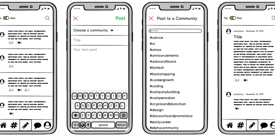
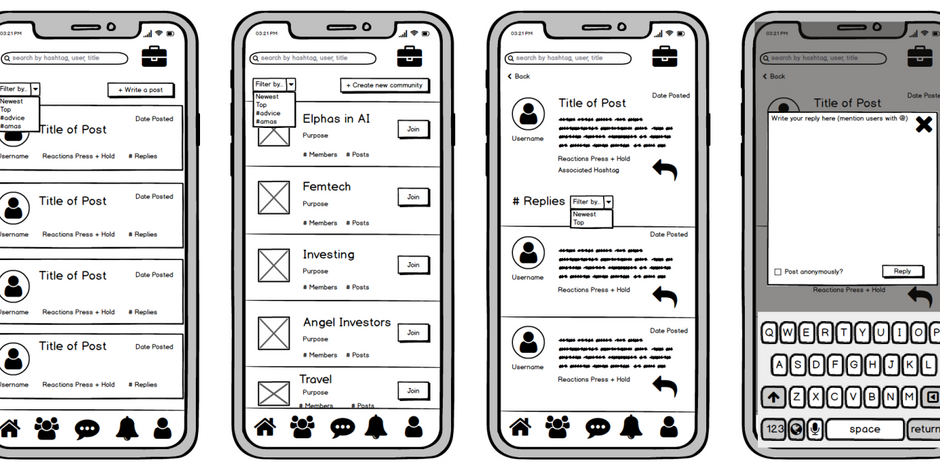
4 sets of wireframes were created to explore different interaction paths
HI-FI MOCKUP
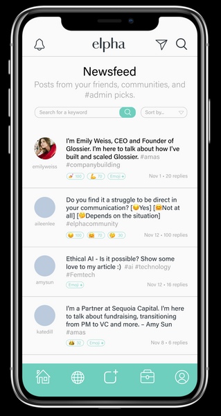
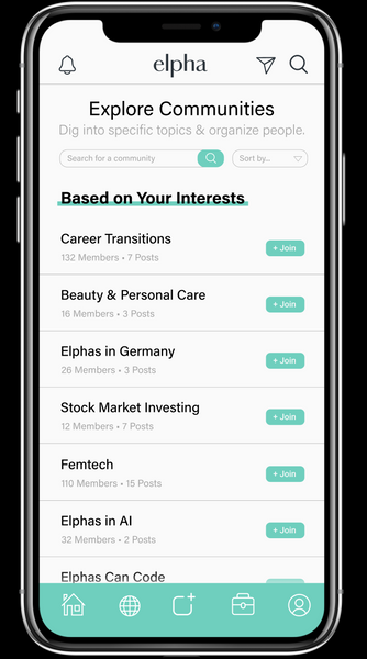
We implemented the bottom navigation bar to accommodate the many features that Elpha offers—users can access Home, Community, Post Box, Jobs, and Profile, regardless of where they are on the app. We also decided to place the Direct Message and Notification buttons as these are the functions we want to highlight in the mobile version of Elpha. The icons on the top and bottom navigation bar are specified through titles of each page but do not have text labels, as they follow the same familiar mental model (similar imagery, i.e. house = homepage, person outline = profile, etc.) as other apps of similar layout such as Instagram and LinkedIn. Based on the critique session feedback, we have decided to reduce the amount of text on the screen by using a pop-up screen with an overlayed background. We also used dividers to establish more clarity between contents. These changes created the hierarchy in information and increased the overall readability.


